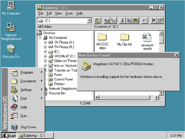
Once upon a time, when computer operating systems learned to multi-task, their basic user interfaces started to reflect this ability: applications now ran simultaneously in a number of windows that could be freely opened, closed, moved around and resized on the screen. This was (an important aspect of what is) called “the desktop metaphor”.
Always-visible gadgets like “task bars”, “docks” and “menu bars” were introduced for basic tasks like managing open windows and opening new ones.
It took for the advent of super-user-friendly mobile devices (limited multitasking ability, limited screen space) for developers to notice that unlike modern desktop computers, people aren’t actually very good at multitasking. At least for the tasks they do with mobile devices, people are perfectly happy with only having one window, or menu, open at a time.
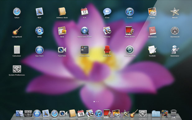
This trend is now coming to the desktop computer. Apple recently announced a new release of Mac OS X, explicitly stating that many of the new features are inspired by the iPhone and the iPad. The most striking one is Launchpad. It is nothing more than a menu of all available applications, but one that takes up the whole screen. Together with Dashboard and Exposé (now called Mission Control), that’s quite a long list of special-purpose full-screen gadgets taking over window managing/application launching functions traditionally fulfilled by task bars etc. And together with Mac OS X’s new full-screen apps (not quite your traditional maximized windows), it quite clearly marks a turn toward a one-window-is-visible-at-a-time principle.
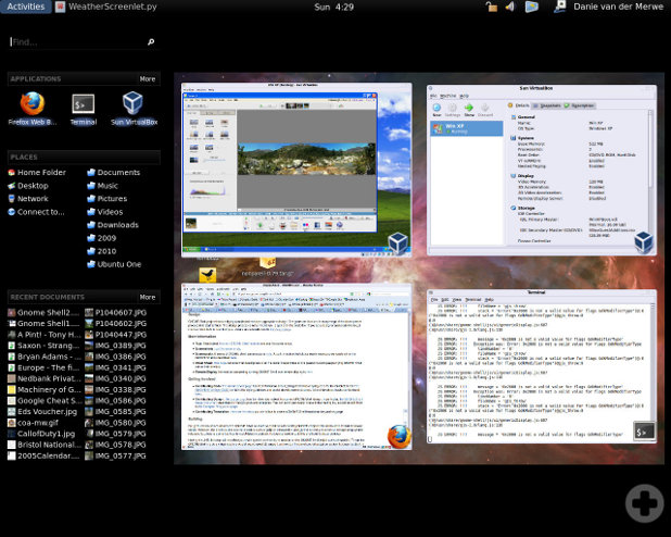
A similar thing is going on in GNOME Shell. They are cramming everything for which there used to be panels and menus into one full-screen view called Activities, including Exposé-like overviews of the desktop(s). If the multitude of full-screen gadgets in Mac OS X seems confusing, the GNOME approach of cramming so many things into one full-screen view seems bizarre. If upon clicking a button with the ultimate goal of, say, firing up the calculator, the contents of the whole screen change and hide my currently open windows, I consider this a high price to pay. In return, there should at least be a gain in focus, as with the Mac OS X gadgets, each of which shows more or less one kind of thing only.
So what is a desktop environment developer to do if she really wants to advance the state of the art instead of just haphazardly introducing new misfeatures (or taking it slow with moving away from the traditional desktop metaphor, as Microsoft does)? Is there a happy medium between overview and focus? Bear with me for Part 2: The Glorious Future.


Funnily, Unix was multi-user and multi-tasking in 1970, when there wasn’t anything close to today’s user interfaces. Nobody would have claimed back then that computers were simple. But today, we all think computers should be simple. While we accept needing introductions to pretty much everything – raising children, driving a car, playing an instrument, cooking, even hiking (= using your feet), and what not – we don’t accept introductions to computers. They should be as straightforward as holding the spoon for pouring sugar into your morning coffee.
Computers simply aren’t simple. Of course, they can be reduced, but then they’ll lose their power. If that is what users want, a saw without teeth, fine with them. But that’s certainly not what the grandchildren of these guys operating Unix in the 70ies want. So, back to the command line when GUI 2.0 takes over?
One way or the other, I’m sort of an advocate of using GUIs only when the command line clearly doesn’t suffice. But there are many tasks where it doesn’t, such as image editing or browsing the Web. Complex tasks like organizing e-mail or Java code are also eased considerably by graphical tools. So I think I have a better idea than abandoning graphical desktop environments (see the sequel).
Pingback: Developments in Desktop Environments, Part 2: The Glorious Future | Texttheater
The really stupid thing about Mac’s new ‚launchpad‘ is really that it’s just a desktop. Nothing more. You click a button, oh look, shiny, my application and folder icons. You click the button again, you’re back to where you were before.
Well, that’s exactly what the „show desktop“ button did in Windows. (or WIN-D, as a shortcut.)
Nobody used it.
Then again, the best way to find all your applications on a Mac (that are not already on the dock) is to switch to finder, and go Command-Shift-A. Or, of course, open a new finder window, then navigate to ‚Applications.‘ The Windows user at least has a start menu, which the Mac user utterly lacks.
Me, I press WIN-Backspace and just type whatever command name I need.
Not exactly. The Launchpad is also closed, and the old state restored, when you click one of the buttons on it, which makes it more of a start menu – I gather. Not that I’ve tried it.
Wow, Apple are introducing (bad copies of) two things that Windows and GNOME/KDE/… users have had for more than a decade in one release (the other one being fullscreen). Why don’t they first get rid of something that we PC users have never known: that unbelievably counterintuitive context-sensitive menu bar.
I used it a lot and still use GNOME’s equivalent because
I still put temporary stuff on the Desktop. Will have to readjust a little when I start to tile…
No, you won’t. I’m running XMonad currently in tandem with Gnome. That does include Nautilus running in the background. I.e., I have a fully functioning ‚desktop.‘ With clickable icons and all that jazz.
Well, yeah, of course you can’t normally reach those icons, because you don’t see your desktop. But you can quickly flick to an empty workspace and access your desktop from there. It’s trivial to set up a shortcut that guarantees such a desktop, and also brings you back to your prior setup (at least in XMonad.)
That said, I did disable my desktop fully, because some apps used to randomly spawn icons there. Nautilus has a gconf option to disable the clickable desktop part of itself. The background-image function remains.
that unbelievably counterintuitive context-sensitive menu bar.
It’s a feature Mac users like and have grown used to, and with today’s e-culture being all about small devices, it’s not going to go away, methinks.
It does save you considerable amounts of screen real estate (I usually disable the menu bars of all my applications if I can.) I kind of like it, and don’t find it very counterintuitive. It just doesn’t go well with focus follows pointer, which I can’t really live without…
But I don’t think menu bars have much of a future anyway, look at recent versions of Microsoft Office. And on mobile devices they don’t even have a present. Rightly so.